A Relaxing Trio


Date: 12/21/2010

Location: Kona Village Resort

Size: 90" x 30" (Triptych)

Medium: Oil on stretched canvas

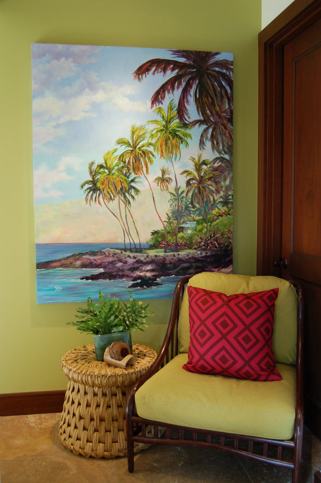
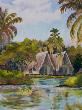
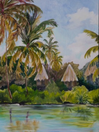
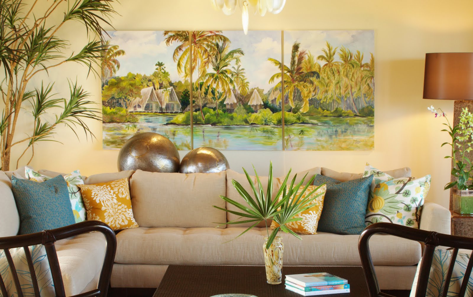
Artist's Comments: For the second commissioned painting for interior designer Eric Henderson, he requested a large triptych to hang as the focal point of the living room. The color swatches provided for me to match were predominantly an yellow ochre with accents of teal blues. I chose Kona Village as the subject in this area due to the fact that this model unit overlooks the Kona Village resort and the thatched roof tops are visible in the distance from the living room. I thought it would be a nice symbolism to have the shoreline of the Kona Village featured here. My proposal included two subjects to select from: one featured the shoreline of Kona Village with waves lapping up onto the shoreline and the other was the inspiration for this piece. As you venture back into the fresh water ponds in the heart of the Resort, the atmosphere gets more relaxing. You find yourself actually taking deep breaths without even realizing it. There is something so soothing about the peaceful reflections in the still waters and the silence of the surroundings. It was easy for me to focus the yellow ochre hues in the old palm leaves as they droop naturally down the tree trunks. I used my creative license to accentuate teal accents in the ponds bringing a little movement to the peaceful reflections. This project was a wonderful experience and the feedback from potential clients has been overwhelmingly positive. My SitaScapes truly do provide a custom feel to this property!


To view other paintings in my collection, click on the section labeled "View all SitaScapes" located at the top right of my blog. I have categorized my paintings by the month as I complete them.

Ke'ei Cottage


Date: 12/18/2010

Location: Keei Beach

Size: 40" x 60"

Medium: Oil on stretched canvas

Artist's Comments: I was approached by an interior designer (Eric Henderson, Henderson Design Group) who commissioned me to create two pieces for a new model unit at the Hali'ipua Villas, Hualalai Resort. He had just been hired to furnish the vacant property and wanted the villa to look personalized. I was very surprised to learn that my pieces would hold prominant positions in the villa. I was so excited to work on this project as it was my first commercial project and the first time I had to customize my pallet to a very specific color scheme. Because I would be working on the pieces prior to Eric installing the furnishings, I had to match my pallet to a series of fabric swatches for each room. For this piece, Eric wanted me to focus on colors reminiscent of bougenvellia; mauves, pinks and white with accents of green. I immediately thought of the area along the Napoopoo shoreline where bougenvellia grow wild; castcading down palm trees; shimmering bright pink in the sunlight. I had recently been at Ke'ei Beach and thought it would provide the perfect setting for this piece. When approaching the painting I kept reminding myself to stay true to the color pallet and as a result you can see how I used mauve tones throughout: from the pale pink in the distant clouds and mountain to the deep shadows of the palm tree and lava rock shoreline. This painting came together very easily although it was so large that it took up pretty much all of our usable space in our apartment!


To view other paintings in my collection, click on the section labeled "View all SitaScapes" located at the top right of my blog. I have categorized my paintings by the month as I complete them.

Love at First Visit

Date: 12/15/2010

Location: Kona Village Resort

Size: 18" x 14"

Medium: Oil on stretched canvas

Artist's Comments: While painting on location at the Kona Village I was approached by a guest who commissioned me to paint the very first Hale he and his wife had stayed in over 15 years ago. They fell in love with the Resort from that moment and have been returning to the Resort ever since; however, they still have a sweet spot for their first Hale #LS1. The painting needed to be completed in time for Christmas so I was not able to paint the Hale on site (guests were booked in the hale for the entire month). I worked instead from a photo which at captured in the early morning hours when the sun was just rising above Mauna Kea casting wonderful shadows on the foreground. Some the major elements my client wanted me to capture were the pink bougainvillea in bloom, the native Noni tree and of course their delightful Hale. I presented a few different options for composition and he selected the one that made him feel like he was returning "home" from a day at the beach - basking in the warm sunshine. He also requested that I use predominantly my pallet knife technique as he preferred the textured finish. He and his wife collect art from local artists in all their international travels and I was honored that he selected my work for such a fond gift; one that would forever remind he and his wife for their first visit to Kona Village.

To view other paintings in my collection, click on the section labeled "View all SitaScapes" located at the top right of my blog. I have categorized my paintings by the month as I complete them.

The Makings of a Green Flash

Date: 12/3/2010

Location: Hualalai Resort

Size: 18" x 18"

Medium: Oil on stretched canvas

Artist's Comments: For the past three years I have created a painting for Hualalai Realty to use for their annual Holiday Greeting Card sent to their customers. This year I decided to create a piece symbolic to the best part about living along the shoreline in Hawaii; the opportunity to see the green flash! I found out that the Kohala Coast is one of the best locations to witness this phenomenon and I think many will agree that there is no better place to witness this miracle than from the Beach House restaurant. More will agree that the best chance to view the elusive green flash is after a few drinks from L.J. (our favorite bartender). This evening the sunset was particularly captivating due to the overbearing purple and pink shades dancing across the sky. The seemingly random cloud formations caught my eye as they angled up against the shoreline creating a nice visual conversion with the beach. I used a pallet knife technique for the ocean and filled it with deep purple and ultramarine hues to ground the softness of the rest of the painting. And for the record, there was indeed a green flash this evening and yes...I did partake in one of L.J.'s fabulous creations!

To view other paintings in my collection, click on the section labeled "View all SitaScapes" located at the top right of my blog. I have categorized my paintings by the month as I complete them.
The artist does not authorize the use or reproduction of any images within this site by any third-party. To receive usage approval, please contact the artist.